Interactive CMS Websites
Problem
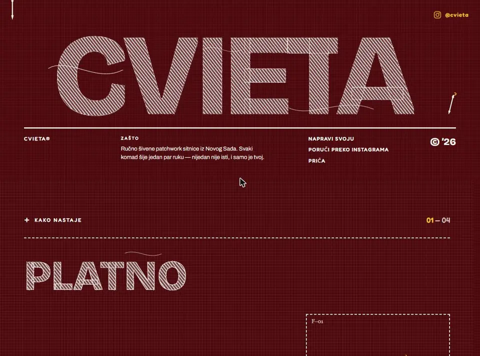
CMS-driven marketing sites for international clients, sold on their design. The animation was not decoration — it was the reason the client picked the studio. But animation-led sites tend to ship as the thing that looks right on the designer’s machine and falls apart on a mid-range Android or with a screen reader.
Constraints
Pixel-strict Figma with no license to simplify, editors who had to be able to change any of it through the CMS without breaking layout, and a browser matrix wider than a typical app project. Accessibility and animation pull in opposite directions by default, and neither was allowed to lose.
What I chose · Outcome
I treated motion as a layer that had to degrade cleanly rather than as the structure itself — semantics and layout correct first, animation composited on top of transform and opacity so it stays off the main thread, and honouring reduced-motion rather than treating it as an edge case.
- Animation on transform/opacity only — no layout thrash on mid-range devices
- Reduced-motion respected as a first-class path, not a disabled one
- Pixel-strict Figma shipped without compromising semantics or keyboard order
- Cross-browser rendering fixes across a client-mandated matrix wider than typical app work